Configuring UI, toolbar and widgets
Toolbar modes
There are three toolbar modes:
Classic toolbar
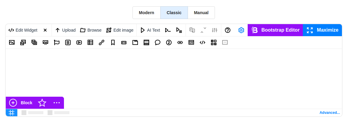
The Classic Toolbar presents the familiar interface characteristic of CKEditor and TinyMCE. Alongside widget buttons, it introduces additional functionalities like "Configuration" for swift access to visual editor settings, "Bootstrap Editor" for seamless transitioning into "Bootstrap grid" mode for block structuring, and "Maximize" for a full-screen editing. To enhance convenience, the Bootstrap quick panel facilitates rapid addition and rearrangement of Bootstrap blocks without the need to switch to Bootstrap Grid mode.
To hide some buttons, click the desired button, in the dialog that opens you can control the visibility of the button, or rename them, and incorporate informative tooltips.
Modern toolbar
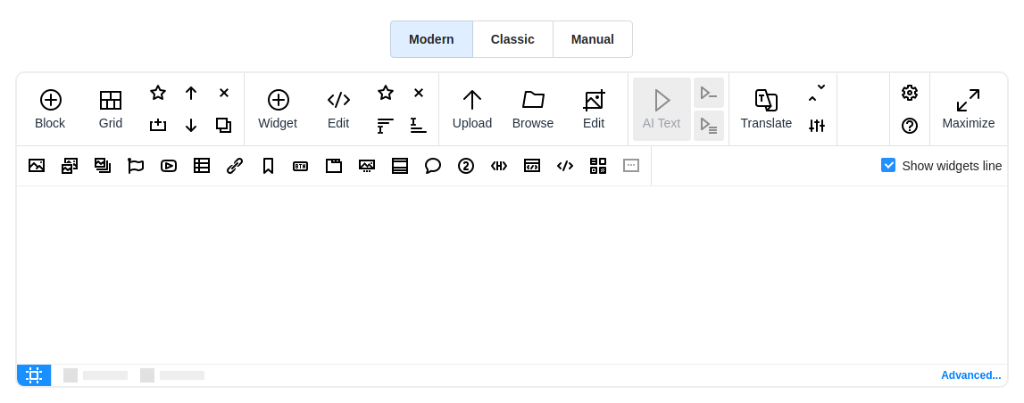
The modern toolbar differs from the classic toolbar with its new clean design. Options for hiding buttons, renaming titles, and adding tooltips remain the same. The buttons are already grouped into sections:
- Bootstrap editor tools
- Widgets and related tools
- Tools for working with images and files
- Services (AI text generator, Translator)
- Editor settings (Configuration, Info)
For swift access to widgets, you have the option to enable all widgets in the additional toolbar line by checking the "Show Widget line" checkbox, or selectively enable specific ones by toggling their visibility buttons.
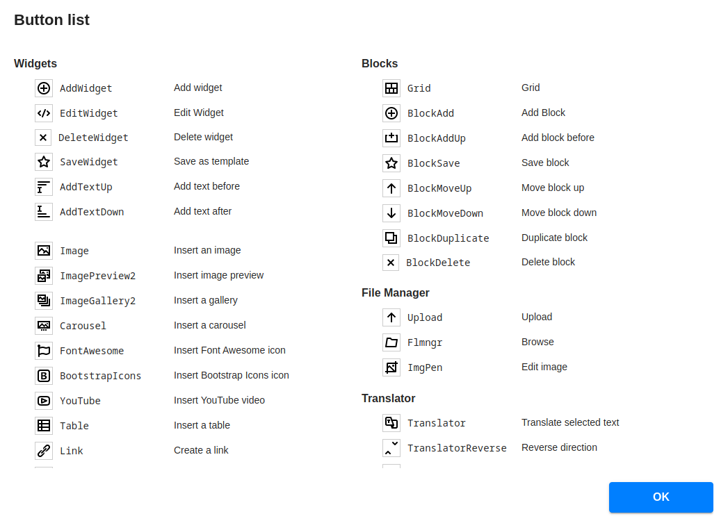
Manual toolbar
You can customize your editor's toolbar manually according to your preferences by adding the necessary buttons. When selecting the manual toolbar option, N1ED will present you with a list of available toolbar buttons to choose from.
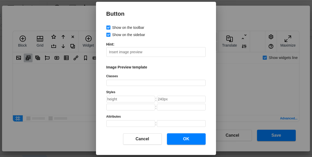
Widget templates
In the configuration panel, you have the ability to customize not only the toolbar but also the widgets themselves. For instance, you can craft widget templates by defining classes, styles, and attributes granting you full control over their appearance and behavior.
To do this, click the desired button, in the dialog that opens you can set your own settings for the corresponding widget.
Structure highlighting
Structure highlighting enables users to visualize the underlying structure of their content as they work. By highlighting elements such as Bootstrap structure (containers, rows, columns) and non-Bootstrap content like headings, paragraphs, and other formatting components, the editor provides a clear overview of how the content is organized.
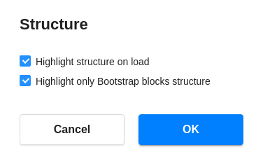
The usage options:
- Automatically on load: Set the tool to activate automatically upon editor launch.
- Manual activation: Uncheck "Highlight structure on load", enabling you to engage the tool precisely when required, preserving an unobtrusive workflow.
- Highlight Bootstrap structure: Select the option to illuminate only Bootstrap structure elements, such as containers, rows, and columns. This targeted highlighting enhances your understanding of the layout's framework.
- Highlight any structure: Alternatively, you can uncheck "Highlight only Bootstrap blocks structure" to illuminate all elements within the content, offering comprehensive visibility into the arrangement and aiding in meticulous editing.
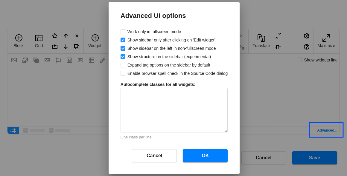
Advanced options
You can change the advanced UI settings for the editor view to suit your preferences.
-
Work only in fullscreen mode
By selecting this option, you will always load N1ED in fullscreen mode. This mode is convenient for working with the Bootstrap grid when creating block structures. Additionally, you can switch screen size views within it to test your content's responsiveness.
-
Show sidebar only after clicking on "Edit widget"
This option is for the non-fullscreen mode, determining when to open the sidebar for editing elements.
Note: Do not hide the "Edit widget" button on the toolbar in combination with this setting.
If the option is set to
false, the sidebar will always open as soon as an element is selected in the editing area. -
Show sidebar on the left in non-fullscreen mode
true— position the sidebar to the left of the editor.false— position the sidebar to the right of the editor. -
Show structure on the sidebar
For widgets with a high level of nesting, breadcrumbs are duplicated on the sidebar for quick toggling between composite elements.
-
Expand Tag options on the sidebar by default
Tag options are collapsed by default. You can modify this behavior if you frequently need to access this tool during editing to add classes, styles, and attributes.
-
Enable browse spell check in the Source Code dialog
-
Autocomplete classes for all widgets
Here, you can add your theme classes for the autocomplete feature in Tag options.
Configuration parameters
Fullscreen mode only
Check this button if you want to force the fullscreen mode for editing content. In minimized mode the overlay on the editor will be drawn (clicking on it will maximize the editor).
ui.modestringclassic'classic', 'fullscreen'Show sidebar only when maximized
If you turn off this checkbox, this will change the way of accessing settings of the widget selected in the editor. By default, it will show the settings in the left sidebar in fullscreen mode and will call the dialog by "Edit widget" click in normal mode. If this checkbox is selected, you will always see the widget configuration in the sidebar.
ui.showSidebarOnlyInFullScreenbooleantrueDefines sidebar or dialog mode is used in normal mode (only when ui.mode equals to 'classic'.
Sidebar is on the left
Sidebar position in normal mode.
ui.leftSidebarbooleantrueTop buttons
Click on any of the buttons and configure its title and visibility on the top right corner of a toolbar of your editor
ui.showFullScreenButtonbooleantrue"Maximize" button visibility
ui.fullScreenButtonTitlestringMaximizeFullscreen button title in normal mode
ui.fullScreenExitButtonTitlestringOKFullscreen button title in maximized mode
ui.showBootstrapEditorButtonbooleantrueBootstrap Editor button visibility
ui.bootstrapEditorButtonTitlestringBootstrap EditorBootstrap Editor button title
ui.gridButtonTitlestringGridGrid button title ("Bootstrap Editor" button in maximized mode)
ui.showConfButtonbooleantrueConfiguration button visibility
ui.confButtonTitlestringConfiguration button title
Use automatic toolbar
By default, N1ED will fill a toolbar of your CKEditor or TinyMCE with new buttons automatically and you do not need to change toolbar configuration in the initialization script (CKEditor/TinyMCE) or inside config.js (CKEditor only). But if you uncheck this option, the list of buttons available for adding on a toolbar will be shown and only the button you add manually will be displayed. Change this option only if you know how to configure CKEditor/TinyMCE toolbar and want to configure it in a special way.
ui.useAutoToolbarbooleantrueAuto toolbar lines
The auto toolbar can be a single line or multiline in normal (not fullscreen) mode. Set this option to force the number of lines or make autodetection of the best view (based on editor width).
ui.autoToolbarLinesnumber0, 1, 20 means auto, 1 or 2 mean the number of lines
Auto toolbar lines (full screen)
The same as previous option, but in fullscreen mode
ui.autoToolbarLinesInFullScreennumber0, 1, 20 means auto, 1 or 2 mean the number of lines
Toolbar
Click on any of the buttons in the list and configure its visibility, title, and mouseover hint. All names of buttons (used as keys) are enumerated below.
ui.toolbarButtons{[name: string] => {title?: string, hint?: string, isVisible?: boolean}}{"Upload":{"title":"Upload","title_v2":"Upload","hint":"","hint_v2":"","isVisible":true,"isVisible_v2":true,"_integrationTypes":["n1ed","flmngr"]},"Flmngr":{"title":"Browse","title_v2":"Browse","hint":"","hint_v2":"","isVisible":true,"isVisible_v2":true,"_integrationTypes":["n1ed","flmngr"]},"ImgPen":{"title":"Edit image","title_v2":"Edit","hint":"","hint_v2":"","isVisible":true,"isVisible_v2":true,"_integrationTypes":["n1ed","flmngr","imgpen"]},"Txt42":{"title":"GPT Text","title_v2":"GPT Text","hint":"","hint_v2":"","isVisible":false,"isVisible_v2":false,"_integrationTypes":["n1ed","txt42"]},"Txt42Less":{"title":"","title_v2":"","hint":"Less GPT Text","hint_v2":"Less GPT Text","isVisible":false,"isVisible_v2":false,"_integrationTypes":["n1ed","txt42"]},"Txt42More":{"title":"","title_v2":"","hint":"More GPT text","hint_v2":"More GPT text","isVisible":false,"isVisible_v2":false,"_integrationTypes":["n1ed","txt42"]},"Translator":{"title":"","title_v2":"Translate","hint":"Translate selected text","hint_v2":"","isVisible":true,"isVisible_v2":true},"TranslatorReverse":{"title":"","title_v2":"","hint":"Reverse direction","hint_v2":"Reverse direction","isVisible":true,"isVisible_v2":true},"TranslatorConf":{"title":"","title_v2":"","hint":"Translation options","hint_v2":"Translation options","isVisible":true,"isVisible_v2":true},"Info":{"title":"","title_v2":"","hint":"Info","hint_v2":"Info","isVisible":true,"isVisible_v2":true},"Image":{"title":"","title_v2":"","hint":"Insert an image","hint_v2":"Insert an image","isVisible":true,"isVisible_v2":true,"_integrationTypes":["n1ed","flmngr"]},"ImagePreview2":{"title":"","title_v2":"","hint":"Insert image preview","hint_v2":"Insert image preview","isVisible":true,"isVisible_v2":true,"_integrationTypes":["n1ed","flmngr"]},"ImageGallery2":{"title":"","title_v2":"","hint":"Insert a gallery","hint_v2":"Insert a gallery","isVisible":true,"isVisible_v2":true,"_integrationTypes":["n1ed","flmngr"]},"FontAwesome":{"title":"","title_v2":"","hint":"Insert Font Awesome icon","hint_v2":"Insert Font Awesome icon","isVisible":true,"isVisible_v2":true},"BootstrapIcons":{"title":"","title_v2":"","hint":"Insert Bootstrap Icons icon","hint_v2":"Insert Bootstrap Icons icon","isVisible":true,"isVisible_v2":true},"YouTube":{"title":"","title_v2":"","hint":"Insert YouTube video","hint_v2":"Insert YouTube video","isVisible":true,"isVisible_v2":true},"Video":{"title":"","title_v2":"","hint":"Insert a video","hint_v2":"Insert a video","isVisible":true,"isVisible_v2":true},"Table":{"title":"","title_v2":"","hint":"Insert a table","hint_v2":"Insert a table","isVisible":true,"isVisible_v2":true},"Link":{"title":"","title_v2":"","hint":"Create a link","hint_v2":"Create a link","isVisible":true,"isVisible_v2":true},"Anchor":{"title":"","title_v2":"","hint":"Create an anchor","hint_v2":"Create an anchor","isVisible":true,"isVisible_v2":true},"Button":{"title":"","title_v2":"","hint":"Insert a button","hint_v2":"Insert a button","isVisible":true,"isVisible_v2":true},"Tabs":{"title":"","title_v2":"","hint":"Insert tabs","hint_v2":"Insert tabs","isVisible":true,"isVisible_v2":true},"Carousel":{"title":"","title_v2":"","hint":"Insert a carousel","hint_v2":"Insert a carousel","isVisible":true,"isVisible_v2":true},"Accordion":{"title":"","title_v2":"","hint":"Insert an accordion","hint_v2":"Insert an accordion","isVisible":true,"isVisible_v2":true},"Alert":{"title":"","title_v2":"","hint":"Insert an alert","hint_v2":"Insert an alert","isVisible":true,"isVisible_v2":true},"Badge":{"title":"","title_v2":"","hint":"Insert a badge","hint_v2":"Insert a badge","isVisible":true,"isVisible_v2":true},"Header":{"title":"","title_v2":"","hint":"Insert a header","hint_v2":"Insert a header","isVisible":true,"isVisible_v2":true},"IFrame":{"title":"","title_v2":"","hint":"Insert embedded page","hint_v2":"Insert embedded page","isVisible":true,"isVisible_v2":true},"HTML":{"title":"","title_v2":"","hint":"Insert HTML snippet","hint_v2":"Insert HTML snippet","isVisible":true,"isVisible_v2":true},"CustomTemplates":{"title":"","title_v2":"","hint":"Custom widgets","hint_v2":"Custom widgets","isVisible":true,"isVisible_v2":true},"Placeholder":{"title":"","title_v2":"","hint":"Insert Placeholder widget","hint_v2":"Insert Placeholder widget","isVisible":false,"isVisible_v2":false},"JoomlaReadMore":{"title":"","title_v2":"","hint":"Joomla Read More cut","hint_v2":"Joomla Read More cut","isVisible":true,"isVisible_v2":true,"_integrations":["joomla"]},"ImagePreview":{"title":"","title_v2":"","hint":"Insert image preview (LightBox)","hint_v2":"Insert image preview (LightBox)","isVisible":true,"isVisible_v2":true},"ImageGallery":{"title":"","title_v2":"","hint":"Insert a gallery (LightBox)","hint_v2":"Insert a gallery (LightBox)","isVisible":true,"isVisible_v2":true},"Grid":{"title":"Grid","title_v2":"Grid","hint":"","hint_v2":"","isVisible":true,"isVisible_v2":true},"Maximize":{"title":"Maximize","title_v2":"Maximize","hint":"","hint_v2":"","isVisible":true,"isVisible_v2":true,"title_minimize":"Minimize","title_minimize_v2":"Minimize","_caption_title_minimize":"Minimize title"},"BlockAdd":{"title":"Add Block","title_v2":"Block","hint":"","hint_v2":"","isVisible":true,"isVisible_v2":true},"BlockSave":{"title":"","title_v2":"","hint":"Save block","hint_v2":"Save block","isVisible":true,"isVisible_v2":true,"hint_remove":"Remove from templates","hint_remove_v2":"Remove from templates","_caption_hint_remove":"Remove title"},"BlockMoveUp":{"title":"","title_v2":"","hint":"Move block up","hint_v2":"Move block up","isVisible":true,"isVisible_v2":true},"BlockDelete":{"title":"","title_v2":"","hint":"Delete block","hint_v2":"Delete block","isVisible":true,"isVisible_v2":true},"BlockAddUp":{"title":"","title_v2":"","hint":"Add block before","hint_v2":"Add block before","isVisible":true,"isVisible_v2":true},"BlockMoveDown":{"title":"","title_v2":"","hint":"Move block down","hint_v2":"Move block down","isVisible":true,"isVisible_v2":true},"BlockDuplicate":{"title":"","title_v2":"","hint":"Duplicate block","hint_v2":"Duplicate block","isVisible":true,"isVisible_v2":true},"AddWidget":{"title":"Add widget","title_v2":"Widget","hint":"","hint_v2":"","isVisible":false,"isVisible_v2":true},"EditWidget":{"title":"Edit Widget","title_v2":"Edit","hint":"","hint_v2":"","isVisible":true,"isVisible_v2":true},"DeleteWidget":{"title":"","title_v2":"","hint":"Delete widget","hint_v2":"Delete","isVisible":true,"isVisible_v2":true},"SaveWidget":{"title":"","title_v2":"","hint":"Save as custom widget","hint_v2":"Save as custom widget","isVisible":true,"isVisible_v2":true,"hint_remove":"Remove from custom widgets","hint_remove_v2":"Remove from custom widgets","_caption_hint_remove":"Remove title"},"AddTextUp":{"title":"","title_v2":"","hint":"Add text before","hint_v2":"Add text before","isVisible":true,"isVisible_v2":true},"AddTextDown":{"title":"","title_v2":"","hint":"Add text after","hint_v2":"Add text after","isVisible":true,"isVisible_v2":true},"Configure":{"title":"","title_v2":"","hint":"Configure","hint_v2":"Configure","isVisible":true,"isVisible_v2":true}}EditWidget, DeleteWidget, Flmngr, ImgPen, Translator, TranslatorReverse, TranslatorConf, Info, Image, ImagePreview2, ImageGallery2, FontAwesome, YouTube, Table, Link, Anchor, Button, Tabs, Accordion, Alert, Badge, Header, IFrame, HTML, CustomTemplates, PlaceholderIf you use the automatic toolbar, you can hide or show some buttons or change other their properties. Place into this array only buttons, which properties you want to override from defaults/cloud config.
Autocomplete classes for all widgets
These classes will be available in autocomplete dropdown when you add classes to some widget. You can add there some class names from your website theme which you use to style content.
ui.autoCompleteClassesstring[][]