Basics of Bootstrap 12-column system used in TinyMCE and CKEditor
Bootstrap, the framework used for content organization, offers a way to keep content in columns, columns in rows, and rows in containers. Here is an illustration of a typical block that you can create in TinyMCE or CKEditor:
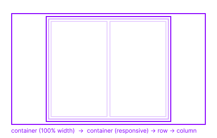
As you can see, N1ED uses two containers - one for handling the fields of the page in the area of the current block, and the second for storing a row or rows, with each row encapsulating a 12-column system.
The 12-column system of Bootstrap means that you can divide each row into 12 vertical slots, and each column can span between 1 and 12 of these slots. Gaps can also exist between columns.
Also, there are more complex configurations that can be achieved by setting alignment inside rows.
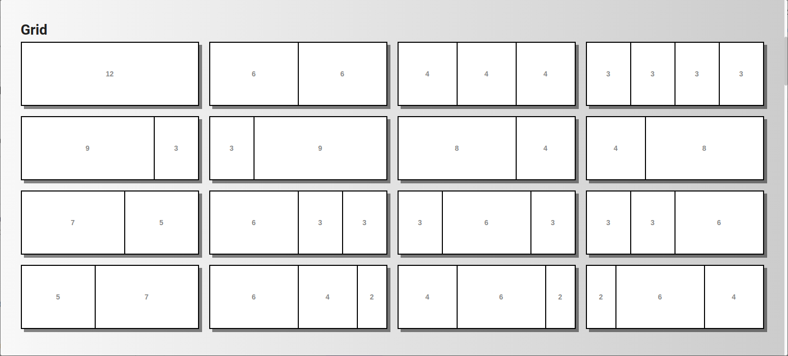
The best illustration of the variations above is the empty grid block templates available for insertion from the block gallery dialog: