How to build and preview Bootstrap responsive content in TinyMCE and CKEditor
Previous chapter - Understanding the basics of Bootstrap's mobile-ready design.
N1ED already handles most of the responsive features transparently. For example, when you insert an empty Bootstrap grid, it adds different classes for mobile and wide-screen breakpoints.
You can then control all your breakpoints in Advanced Bootstrap Editor mode. Switch to this mode by pressing the "Grid" icon and see the breadcrumbs ruler at the top of the content.
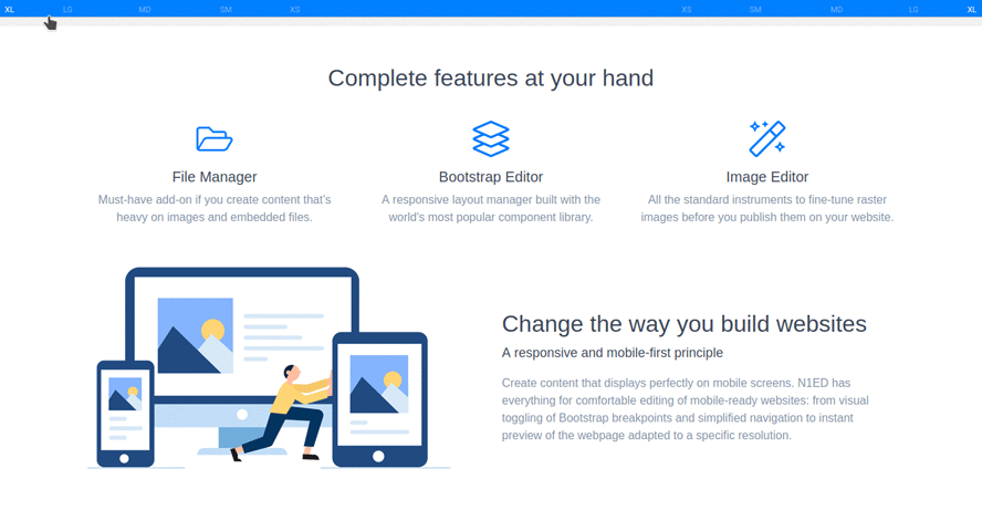
Switching between them will change content display in TinyMCE and CKEditor, forcing the selected Bootstrap breakpoint.
This will have no effect on the real content display on the side of website visitors, as Bootstrap automatically chooses the appropriate breakpoint using its CSS rules.