Basics of creating responsive mobile-ready content with Bootstrap in TinyMCE and CKEditor
Most users nowadays visit websites from mobile devices, so your website should be adapted to their screen size. Different screen widths are grouped into a set of breakpoints (in terms of Bootstrap). On each of these breakpoints, your content should be displayed correctly.
In Bootstrap 5, the breakpoints are: XS, SM, MD, LG, XL, XXL – very similar to clothing sizes. When your website page is accessed by a user device, the content will be rendered according to its screen size by using the nearest breakpoint, which is equal to or larger than the device display width.
For example, the XXL breakpoint defines column arranging behavior for extra-large displays, XL for standard-size displays, LG for small but still desktop displays, and then go tablet and mobile displays.
The screen size may change (e.g., if the user rotates the device), and another breakpoint will be immediately applied. This ensures that your content is rendered correctly on any device.
The breakpoints inherit each other from mobile breakpoints to wider ones. Usually, you don't need to worry about this if you're not using HTML editing for exceptional cases, because when you edit structure with N1ED tools inside TinyMCE/CKEditor, it is done transparently without special actions on your part.
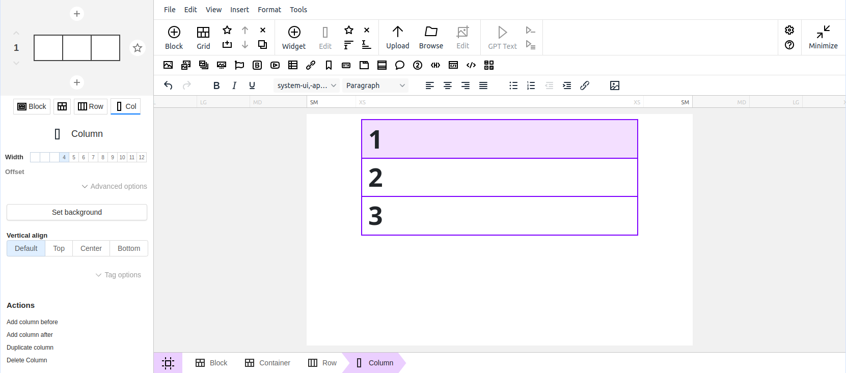
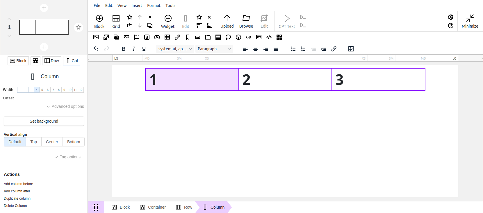
The most useful tool here is the feature to preview responsive content to ensure that it is mobile-ready.