Block constructors
Constructors of basic blocks use the same principles as Custom grid, but have slight structural limitations. You can see these block constructors below. Let's take a closer look at each one.
"Feature (horizontal)" constructor
This is a constructor of blocks with two columns. Such blocks are often used for the "Features" blocks on landing pages when you need to highlight the advantages of your product or service. One of the popular use cases is when "feature + image" blocks alternate with identical blocks with the opposite direction of columns ("image + feature"). See the example below:
Use the 4/12
/ 5/12
/ 6/12
switches to set the width of the column where the main content is to be placed.
The Filling of a column could be Header, Paragraph, Buttons. Or an arbitrary combination.
The width of the second column containing the media widget is calculated automatically. The visual element by default is a placeholder. You can select any widget among available ones (YouTube video, Image, Image Gallery, etc.) instead of the placeholder.
"Feature (vertical)" constructor
This is a special case of the "Feature (horizontal)" constructor. The entire content is placed into one column. You have a choice of placing the media object above or below the main content.
"Text content" constructor
The default use case for a simple text editor — article. You can choose a template with left or right wrapping of the media object.
Conclusion
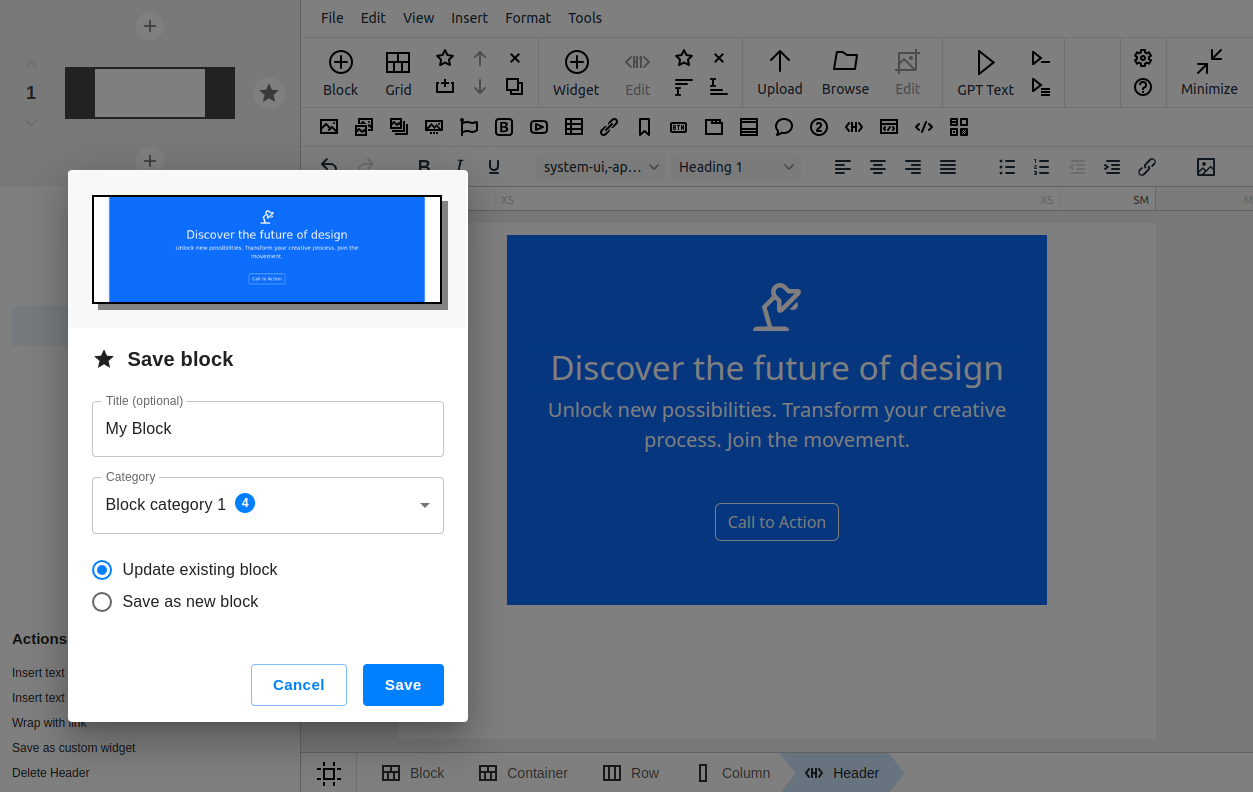
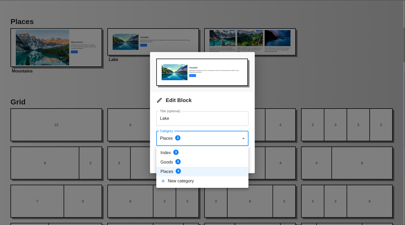
The inserted blocks can be freely modified, deleted; you can add new blocks or duplicate them, move them up or down and adapt to various viewport sizes. You can also create a сustom template based on the current block to reuse it in the future. To do this, click the "Save as template" button.