Boostrap widgets
N1ED offers a number of built-in Bootstrap widgets. N1ED applies the same theme you use on your website which allows you to edit widgets fully WYSIWYG.
 Buttons
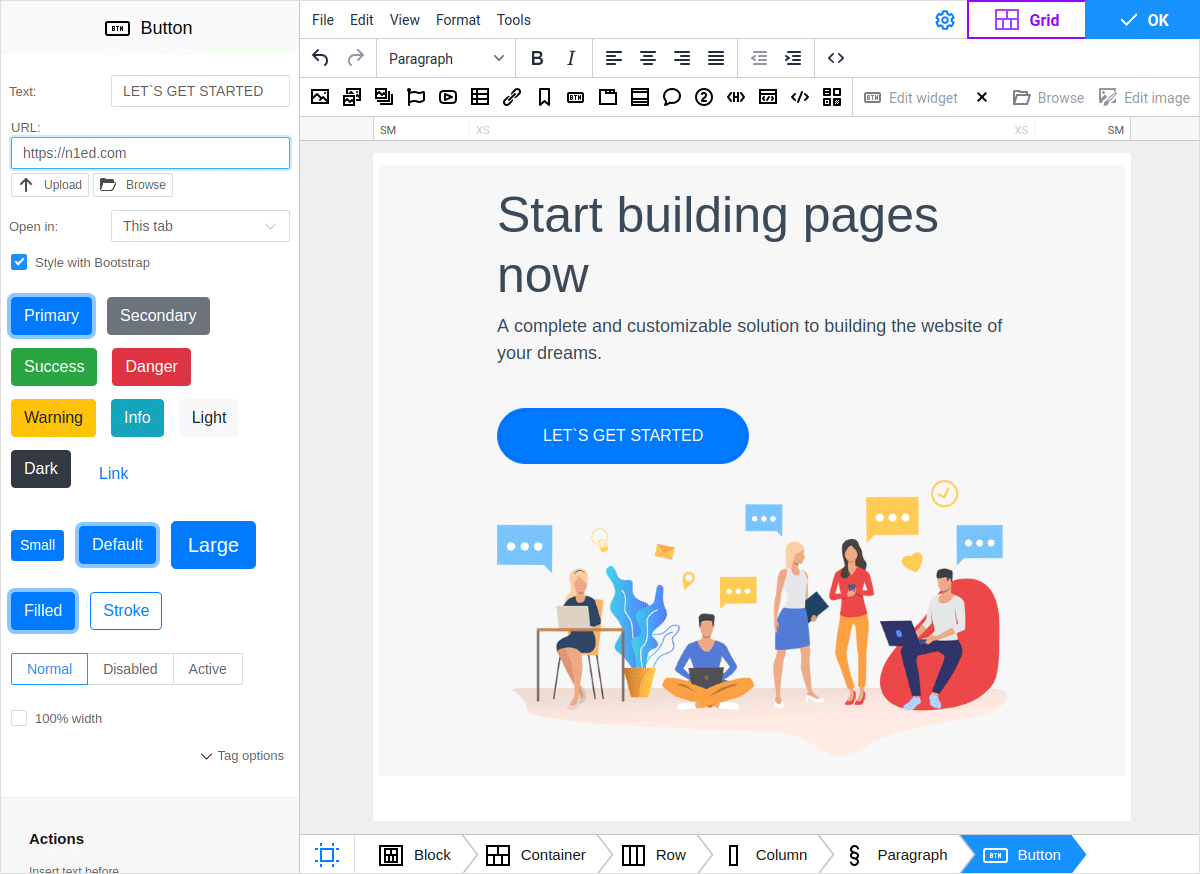
Technically, this is a Link widget styled with Bootstrap.
Just like the Link, there are options to configure URL path and anchor text, the target attribute specifies where to open the linked document.
In the URL field you can link to some article or upload a file for downloading by a user: you van upload it using the Upload options or use the  Browse button to bring up the File manager.
You can read more about links here.
Browse button to bring up the File manager.
You can read more about links here.
The widget offers all Bootstrap’s custom button styles with contextual variations, sizes, states, and more. To apply Bootstrap styles to a newly created or already existing link, activate the "Style with Bootstrap" option in the Button dialog. Turning this option off transforms the button to a usual link.
To insert a button, select one of available button types depending on its semantical purpose — primary, secondary, success, danger, warning, info, light, dark. Specify a size, then if you want the button to fill the entire width of the container, enable the 100% width checkbox. If you prefer the light design of buttons without heavy background, switch to the Stroke style.
 Accordion
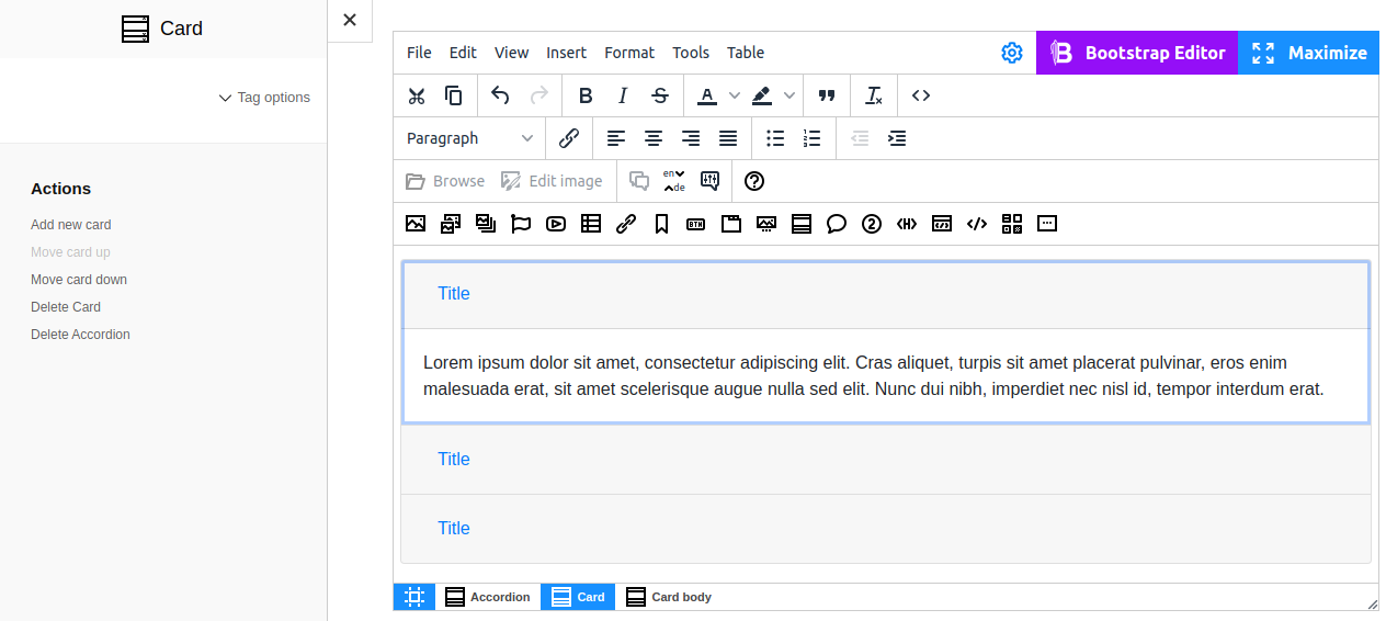
Accordion is a convenient tool that allows switching between information blocks. With this control element users can work more time-effectively by hiding most content and focusing on its key parts only. This way even large volumes of information look much less overwhelming. Another possible use case is content adapted for mobile devices. Collapsing blocks of information minimizes unnecessary scrolling on small screens and offers better view of available content for users.
Widget creates an accordion cards in the edit area. The Card consists of two parts — a header (Card header) and collapsible content (Card body). To add a new card, move the selected card up/down or delete an unnecessary one, use related action on the sidebar or inside widget preferences dialog.
 Tabs
Tabs
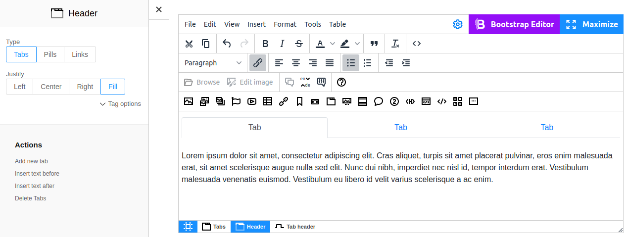
Widget generates a tabbed interface. To create tabbable regions, click the  button on the toolbar.
You can change the view of tabs to Pills (like buttons) or Links. To do this, switch to the Header settings of Tabs (locate it on breadcrumbs below the editor), then select the preferred type.
Also, here you can change the default Left alignment to Right / Center / Fill.
button on the toolbar.
You can change the view of tabs to Pills (like buttons) or Links. To do this, switch to the Header settings of Tabs (locate it on breadcrumbs below the editor), then select the preferred type.
Also, here you can change the default Left alignment to Right / Center / Fill.
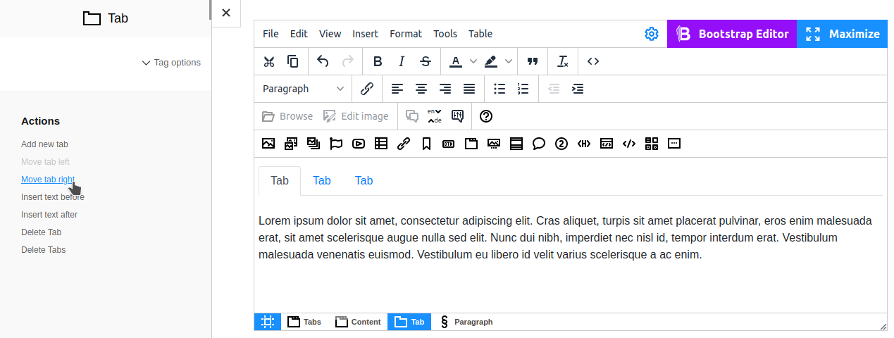
Each tab consists of a clickable Tab header and Tab content. To switch to editing, simply click the corresponding area. The Actions section on the sidebar allows you to add, delete or move tabs.
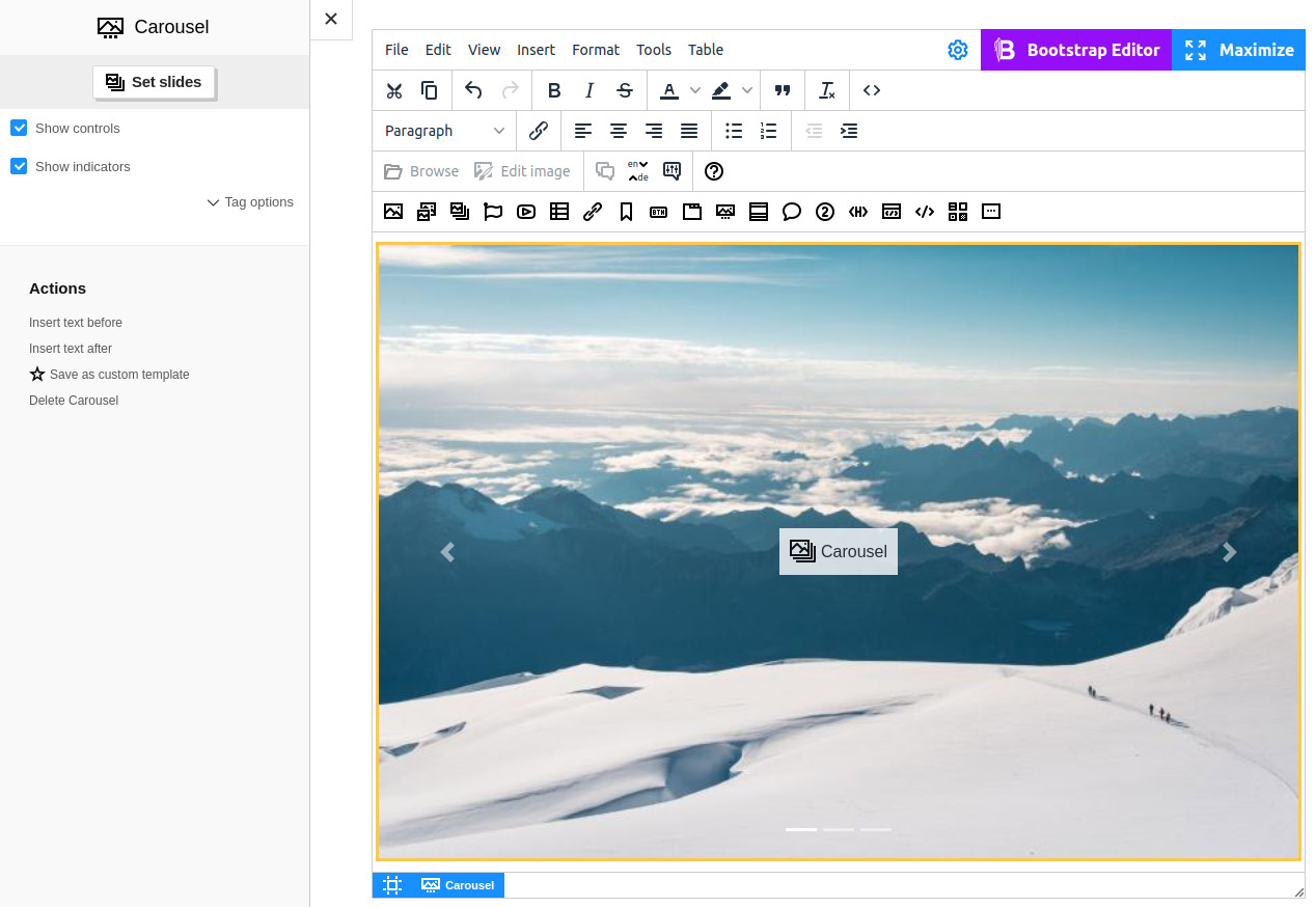
 Carousel
The carousel widget adds a slideshow component for cycling through images. This widget is widely used on landing pages.
In the insertion dialog, you can change the order of images, delete them or add new ones.
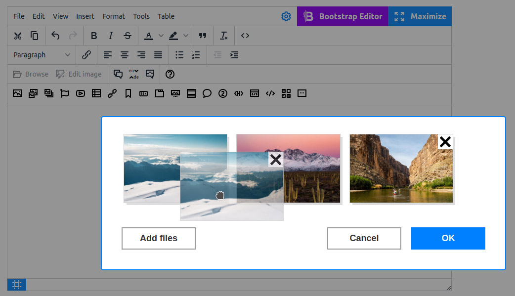
Working with Carousel requires you to keep in mind image sizes. To make images look pretty and change smoothly, make sure they are all of the same size.
You may need additional tools for that, such as resize/crop. You can use them directly from Flmngr file manager by clicking the button  .
.
Even though carousels do support «previous / next» controls and indicators, they are not explicitly required. You can add them at will. You can also change the image gallery in the carousel by clicking the "Set slides" button on the sidebar (or "Edit widget" in the dialog mode).
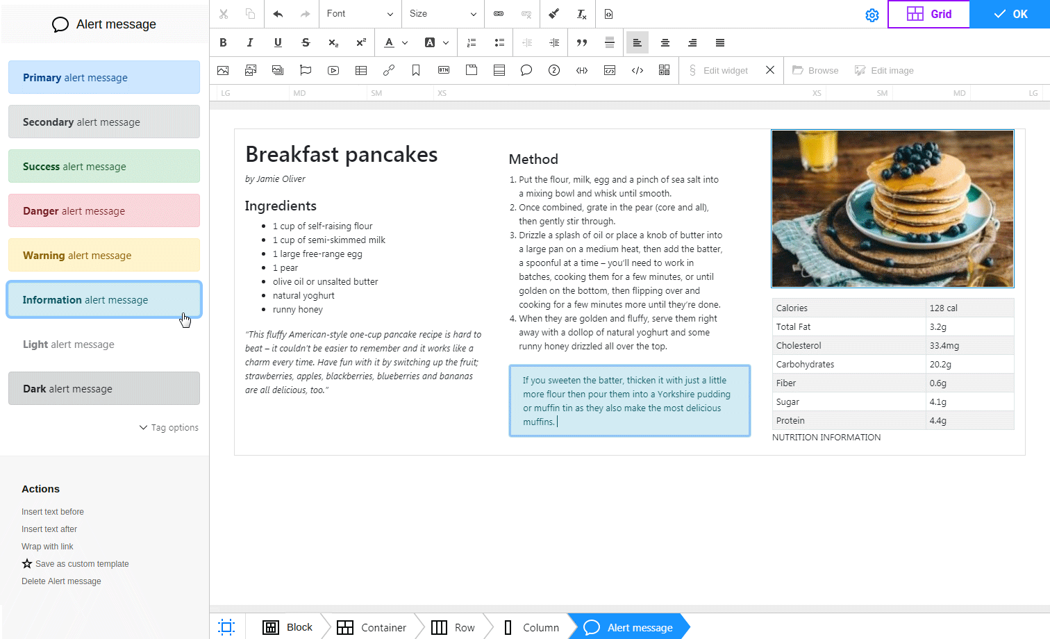
 Alert messages
This widget offers notification templates displayed in response to certain actions of a user. Such messages can inform a user about something that needs attention: primary, secondary, success, danger, warning, info, light, dark. Depending on the semantics, eight color contextual variations are used.
The text of templates can be changed. Simply point the cursor to the alert body and type any content you want.
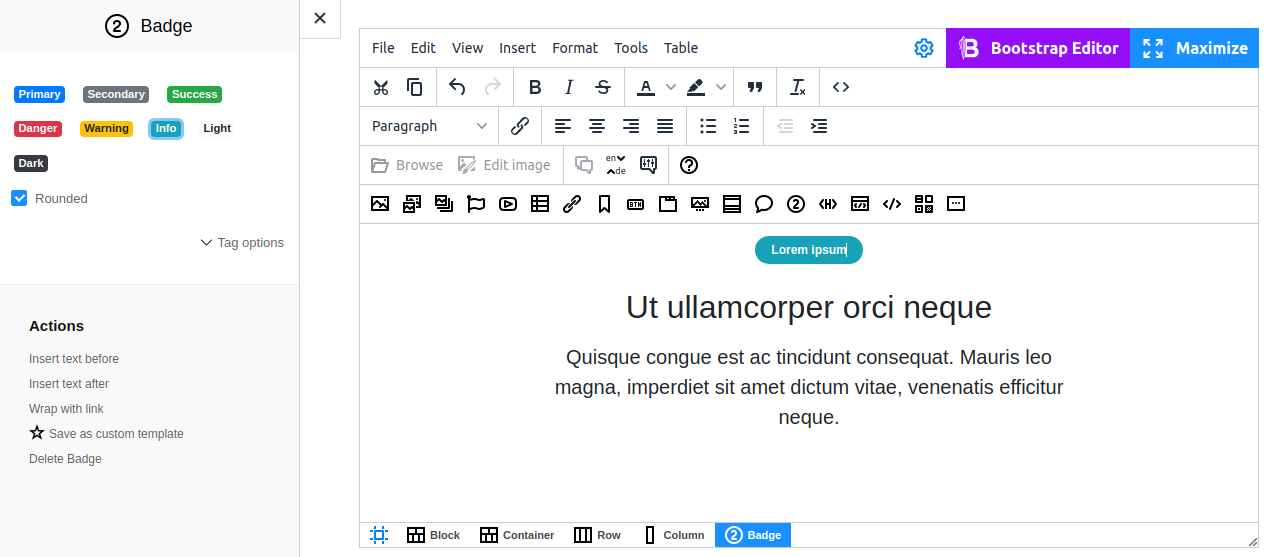
 Badge
Badge
Small and adaptive tag for adding context to just about any content. To add a badge, specify its type by selecting one of the сontextual variations: primary, secondary, success, danger, warning, info, light, dark.
To make badges rounded (with bigger bounding radius and an additional horizontal margin), turn on the "Rounded" checkbox.