How to edit Bootstrap column structure in TinyMCE and CKEditor
After you insert any Bootstrap block, starting with an empty Bootstrap grid, built-in gallery template, or your custom Bootstrap block template, the feature to modify the structure is always available.
Please select the block whose column structure you want to modify by clicking on it or placing the caret inside. Then click on the structure layout mockup:
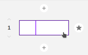
The dialog with the Bootstrap grid editor will appear. You can change the sizes of columns, move them along the row, or shuffle them as you wish with simple mouse actions.


Note that each column displays a number representing its initial order in the content to make it easier to understand which column you are moving or resizing.
After clicking the "Save" button, all the columns in TinyMCE and CKEditor will immediately change their sizes/locations.