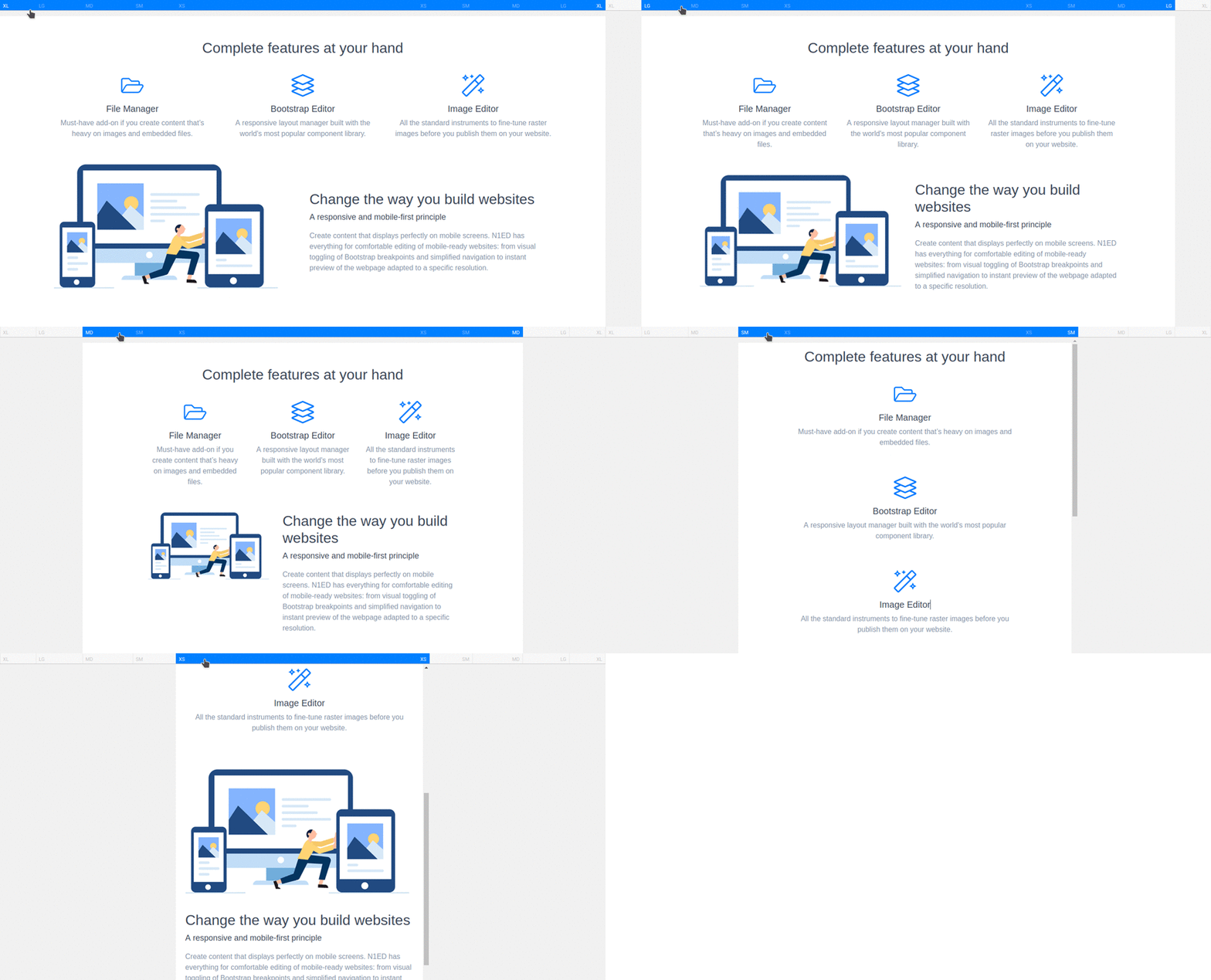
How to get responsive design

The Bootstrap framework is designed to create responsive, mobile-first websites, so it is worth spending a few minutes to take a look at instruments Bootstrap Editor offers for responsive design.

Breakpoints

The width defining behaviour of the responsive layout on various devices (depending on their viewport size) is called a breakpoint. Bootstrap includes the following breakpoints depending on the version of the framework: XXL, XL, LG, MD, SM, XS.

To control how exactly your layout will be adapted to the screen size of a certain device, use the ruler above the editor, just below the toolbar. This preview of your Bootstrap breakpoints (target widths for different mobile devices) right in TinyMCE or CKEditor will make you sure the content displays fine for all of your website visitors. Besides, you can continue editing blocks in any display mode from XS to XXL.

Bootstrap breakpoints
Responsive breakpoints

Columns widths

You can not only assign a width to each column but also do it for different devices independently. The main principle here is to display content as columns on wide monitors but display it line by line on narrow screen mobile devices.

We have already seen how this works in this article. Now, let's repeat that in practice.

There are four columns 3/12 width each for bigger screens. How to adapt them for medium screens and mobile devices? Actually, there are several options. The simplest way is to turn them to 12/12 width. But there are many other options too. On the left, there are screenshots of each column settings, and on the right - the schematic mobile device layout:

Columns width 3/12
3/12
3/12
3/12
3/12
Original layout (always 4 columns in one line)
Columns width 12/12
12/12
12/12
12/12
12/12
Every column takes the entire width of a line
Columns width 6/12
6/12
6/12
6/12
6/12
50% width columns in two lines
Columns width 5/12
5/12
7/12
7/12
5/12
Varying width columns in two lines
Columns width 8/12
8/12
4/12
4/12
8/12
Varying width columns in two lines

As you can see, you can put blocks as you want, and even completely change the layout of the page for mobile devices. Do not forget using the ruler. It displays a preview of your layout and you can instantly see all bottlenecks of your composition.

Offsets

One more vital option for columns is offset. We talked a bit about offsets here. With this option you can create horizontal paddings from the left and modify this setting depending on the screen width.

For example, you can have a structure with offsets on widescreen devices and reset offsets on mobile devices while replacing multi-column layout to one column with 12/12 width:

5/12 (MD, LG, XL)
3/12, offset 1 (MD, LG, XL)
3/12 (MD, LG, XL)
Widescreen device layout (desktop display, laptop)
12/12 (XS, SM)
12/12 (XS, SM)
12/12 (XS, SM)
Smaller device layout (tablet, smartphone)
Column offset
Column 3/12 offset 1
Reset column offset
Reset column offset on small screens

Hiding contents

You can also hide some elements to avoid overcluttering of the mobile version of the page. To do this, click the icon Visibility button next to the corresponding breakpoint. Use this option only for columns, rows or blocks. Make sure blocks are displayed correctly on various screen sizes by using the ruler.

Responsive images

Some images can be too large to display them on the screen without scaling them down (otherwise they will fall outside the boundaries of content). To avoid manual setting of the image width, you can use the Fit a container option that allows an image to fit the current container. And if the image is large enough, it will only occupy so much space on every device regardless of its screen size.

By default, this option is on for all inserted images. However, your older content you may have had before using N1ED could include images without such option. In this case, you can easily turn it on.

Non-responsive image
Image fits container
Fit a container option

Since now your content is mobile-ready! Responsiveness is a must for modern websites.