Work with Tables
A table is a good way to represent structured information. N1ED offers standard tables in a classic implementation.
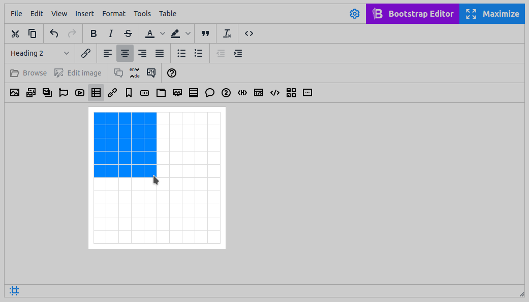
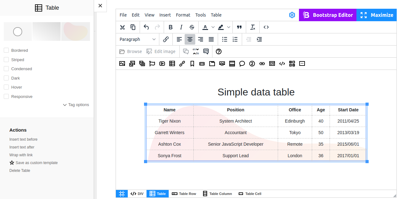
Begin with creating a table  using the dropdown menu. Choose the number of rows and columns as shown on the screenshot below.
Edit Table
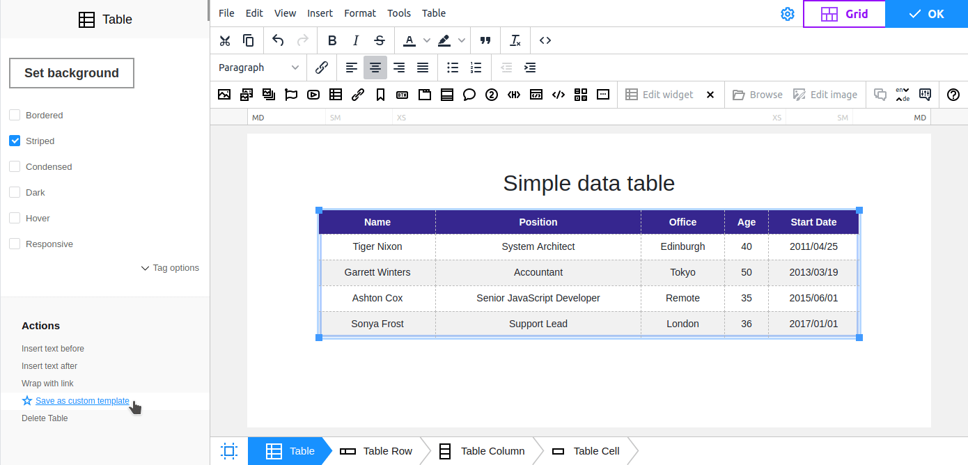
After the table is inserted and filled, you can сonfigure the settings of the table to adjust its appearance.
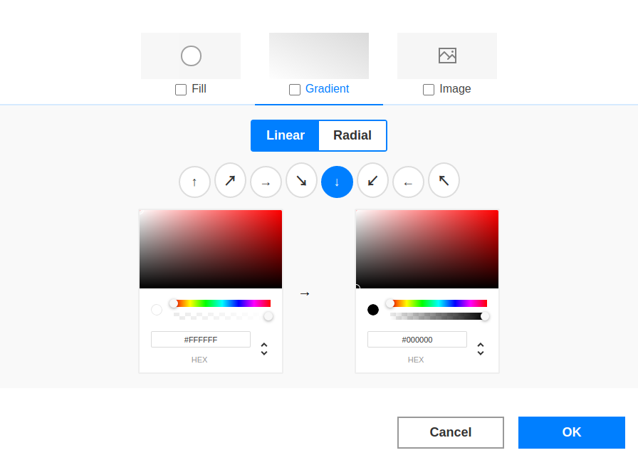
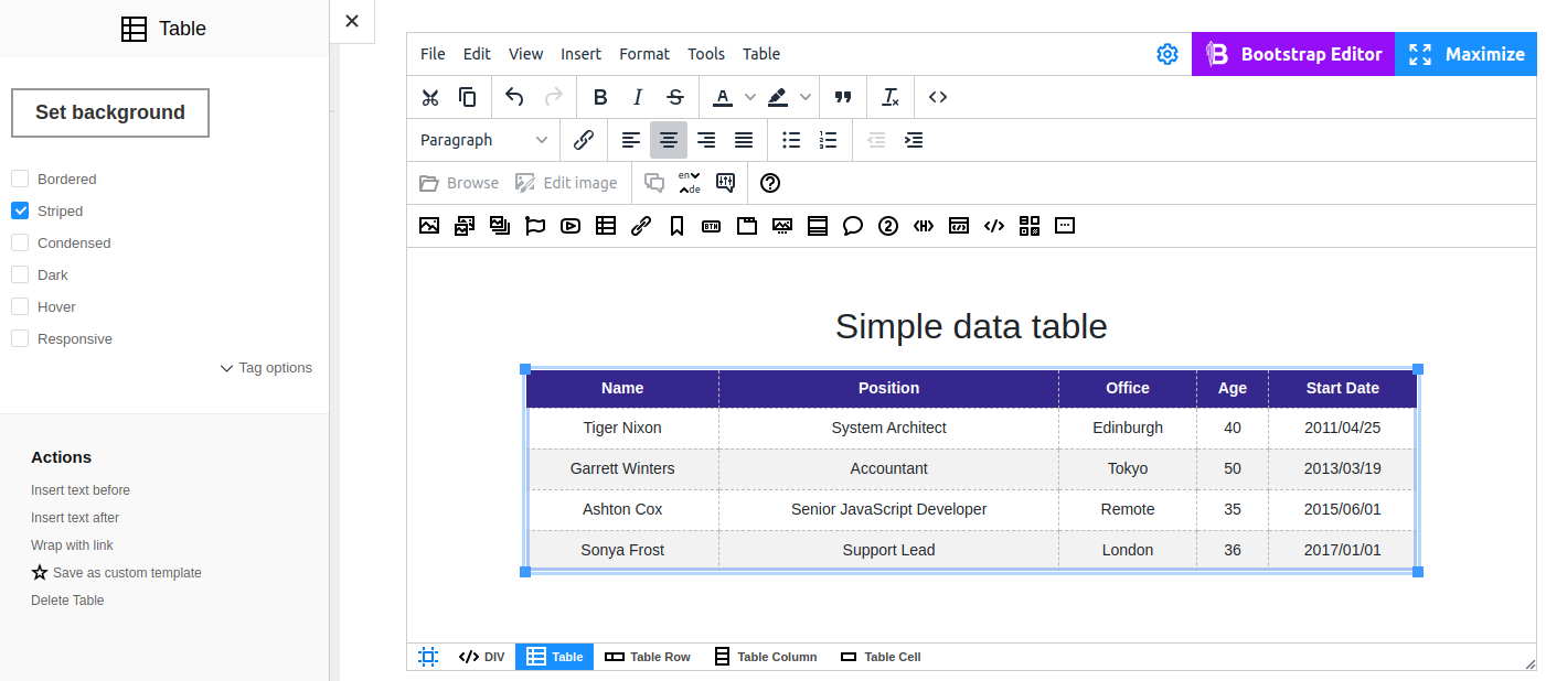
Set Background
The Background feature allows you to select a color background for a table, create a color gradient or upload your own picture. You can also combine various background types.
To put an image as a background, select a file in the File Manager or Upload it from your computer. You can also edit the image right here using the Image Editor tools.
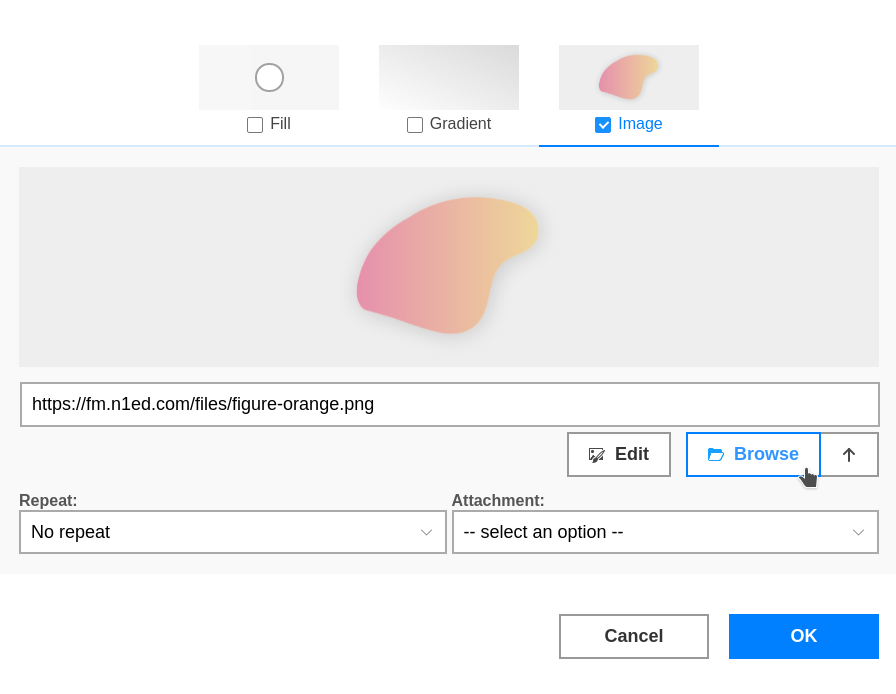
You can modify the settings by switching to one of Background tabs, or disable them completely by turning off the corresponding options.
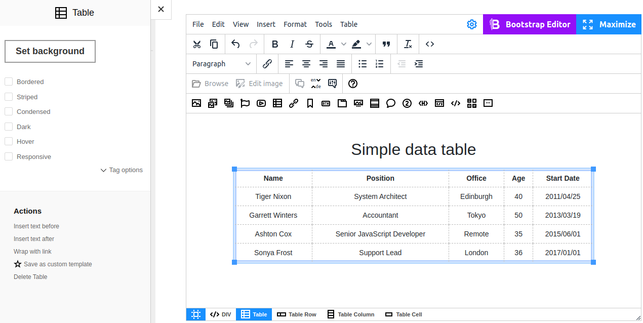
Bootstrap styles
The Table widget supports styles and Bootstrap themes.
Options for a table styled with Bootstrap:
- Bordered adds a border around the table to visually combine various information
- Striped makes it easier to read table data by using rows of alternating colors
- Condensed makes table more compact by cutting cell padding in half
- Dark inverts colors, i.e. displays light text on the dark background
- Hover enables a hover state on table rows
- Responsive creates a responsive table that can be scrolled horizontally when it doesn't fit the viewport
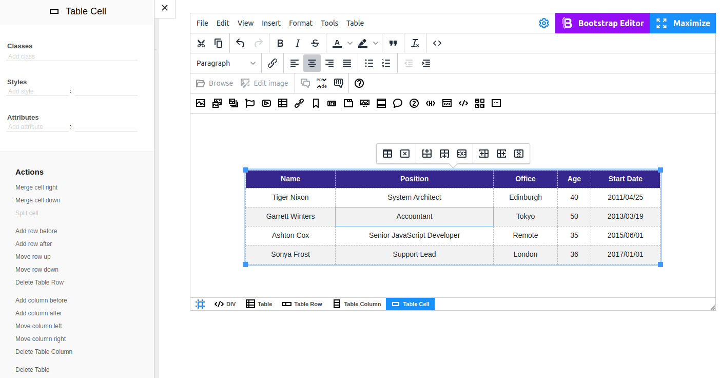
Actions for table elements
Every element of the Table widget has its own set of Actions.
When you place the cursor in any place of the <table> element, you see all tools to add, delete, move, merge or split rows, columns and cells.
The set of available tools is dynamic and depends on the specific selected element.
Actions for Table
- Insert text before / after - positions the cursor just above or just below the object
- Save as custom widget - allows you to create a template for further reusing
- Delete Table - removes the table completely
Actions for Table Row
- Add row before / after
- Move row up / down
- Delete Table Row
Actions for Table Column
- Add column before / after
- Move column left / right
- Delete Table Column
Actions for Table Cell
- Merge cell right
- Merge cell down
- Split cell
In TinyMCE all actions over elements of the table are put into a popup. Additional Actions for the table are also available on the sidebar (or the Edit widget dialog).
Advanced editing
A good layout of a table makes reading information in it much easier. To make the table look lightweight, easy-to-read and stylish, you can create your own classes and apply styles and attributes to them. The same dialogs are available for columns, rows and cells. For advanced settings, use the Tag options.