Build content block by block
Building content block by block is a new way to create pages according to WYSIWYG principles. This approach implies building your own page from ready block templates and filling them with content later.
The difference between the CKEditor/TinyMCE and N1ED
The classic way of WYSIWYG editing of content is to put the entire content into one column including images and video. And the only thing you can change then is the way the text wraps around media objects. This is enough for editing a simple article, but not the entire complex web page.
N1ED is an add-on for TinyMCE and CKEditor that enhances functionality of classic WYSIWYG editors and offers a universal tool to build a block structure — Bootstrap Editor.
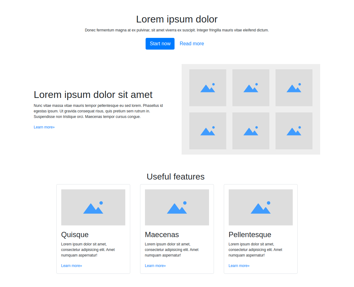
Any web page of an information-rich website or e-shop consists of visually independent blocks each having a certain design, for example a website title, a block of text, a multi-column description, a side bar with images and so on. If you have a set of such blocks you can quickly outline the basic layout of the page and immediately start filling it with content. Below, you can see the example page built with such Bootstrap blocks.
How it works
There are two ways to add Bootstrap blocks, and you can use any of them.
1. Bootstrap Editor in minimize (non-fullscreen) mode
This way is convenient if you prefer editing content in non-fullscreen mode and don't need anything too complex. For instance, when you only need to add a few blocks.
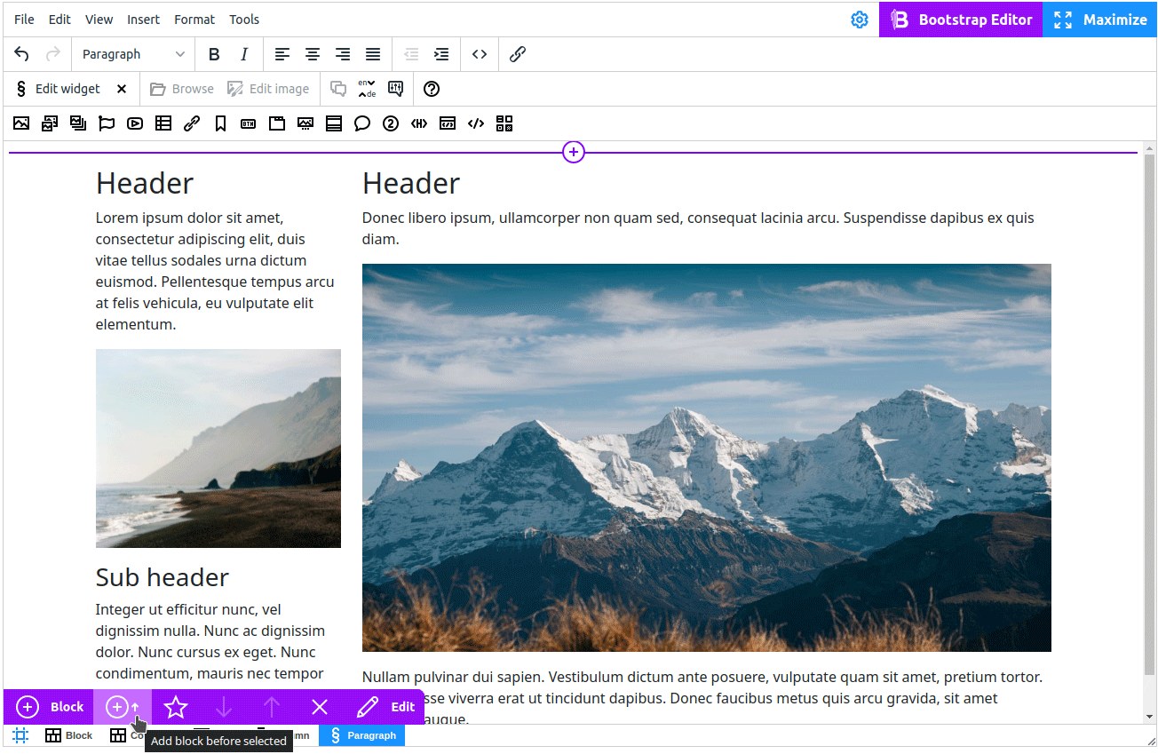
To add a new block, use the "Add block" button on the toolbar. The template menu opens on the left.
In addition to adding blocks, the toolbar also provides buttons to move the selected block up or down, copy and delete it, and save it as a custom block.
If you are using the Classic toolbar, access the Bootstrap quick panel, which is a violet toolbar located below the editor.
If you prefer to compose your block in the fullscreen mode, switch to the Grid view.
2. Bootstrap Editor in Grid mode
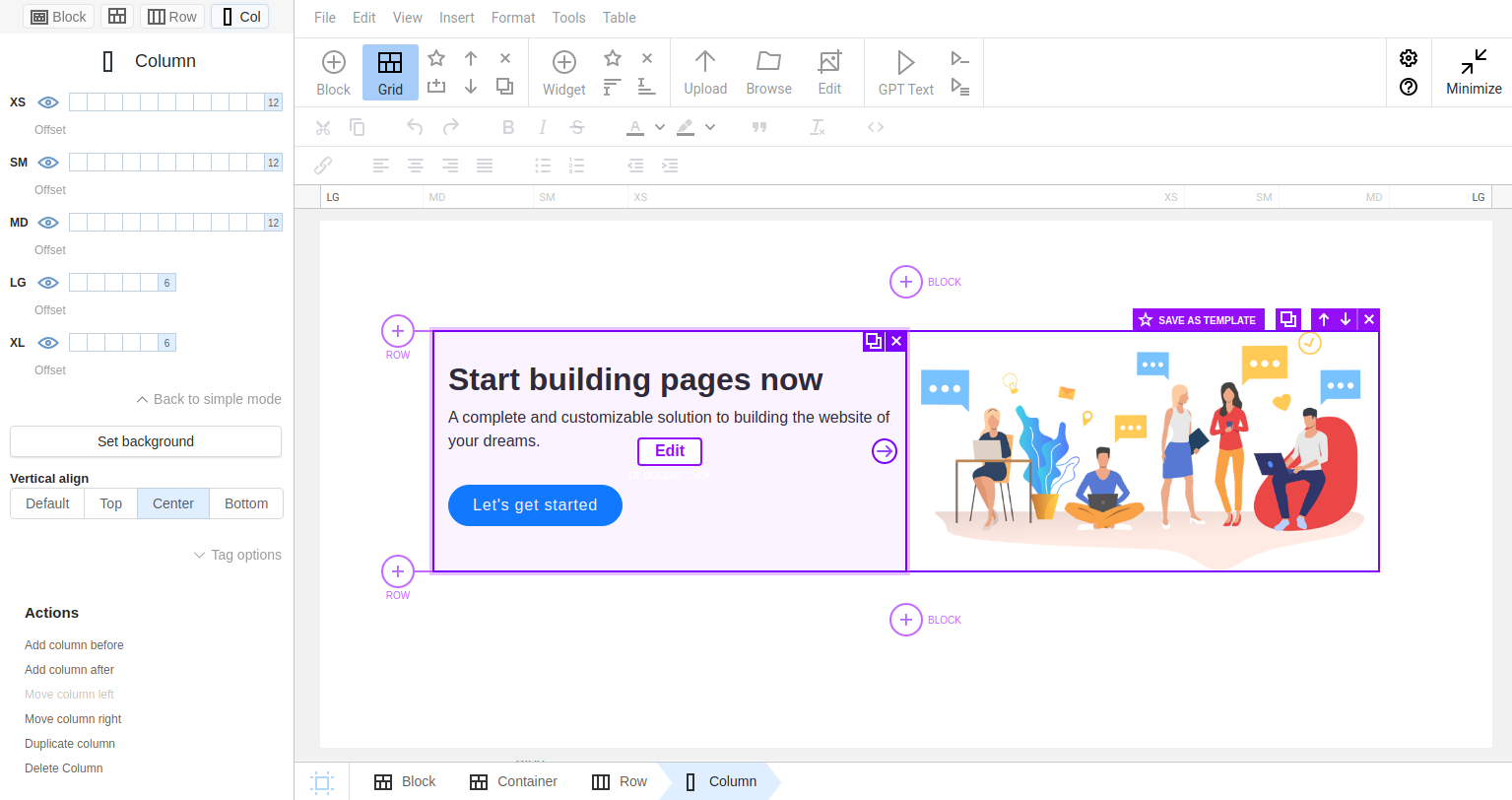
This mode provides a comprehensive set of tools for creating and editing Bootstrap structural elements such as columns, rows, and containers. It is the preferred mode for more complex structural manipulations.
To switch to the structure mode, click button 
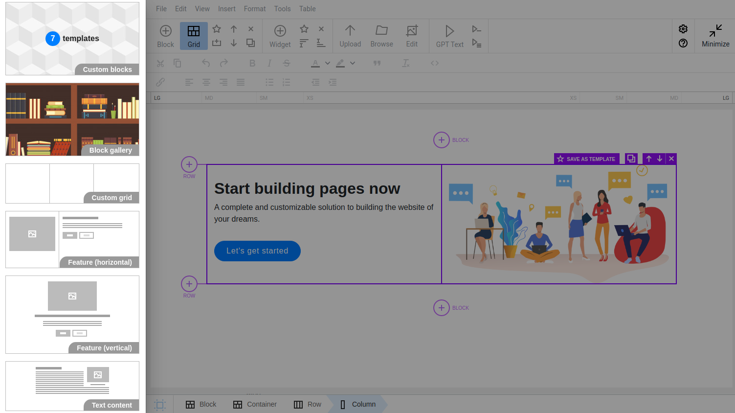
When you switch to Grid editing mode, the following block management buttons become active: Add container, Add row, Delete, Duplicate block, Move block up/down, and Save as template.
When selecting and editing any structural element, it will immediately appear on the sidebar with all the available settings for it. Learn more about the tools for editing the Bootstrap column structure.
Bootstrap block templates
On the panel opened at the left (or at the right, depending on settings of your editor), you can see types of templates to build the page block by block.
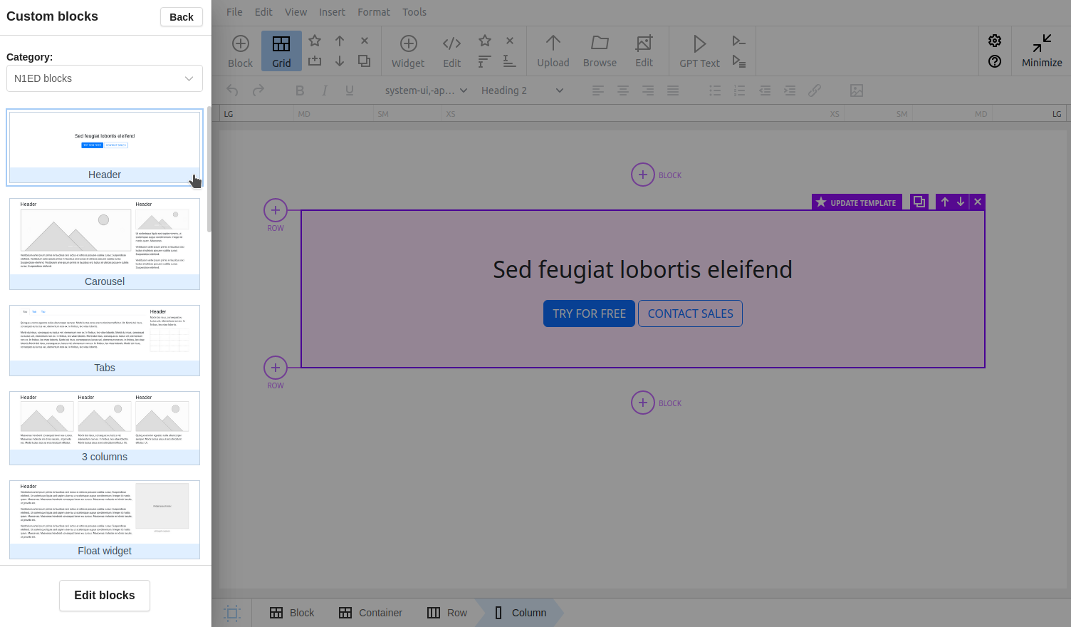
1. Custom blocks
Your own gallery of previously saved custom blocks that you can reuse at any time. This category becomes available as soon as you save your first block (the "Save as template" button). Read more »
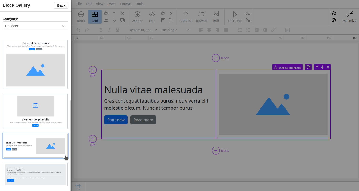
2. Block gallery
You can use ready-made presets. The gallery already has block templates sorted into categories: "Headers", "Content", "Features". Read more »
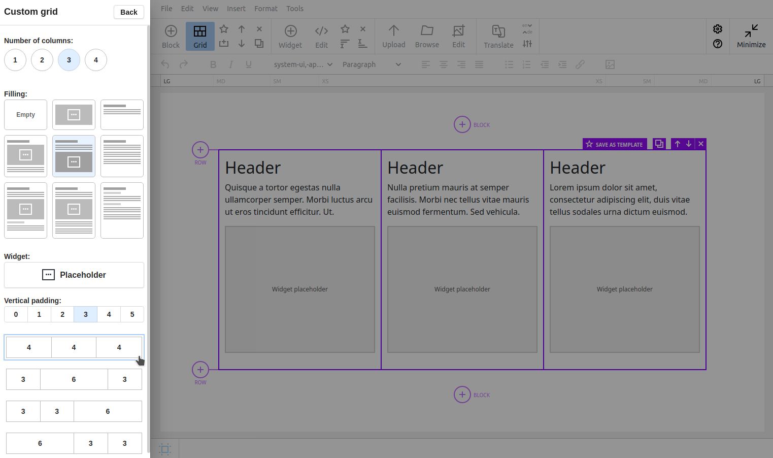
3. Custom grid
A constructor to build a block from scratch with the option to select fillings. Read more »
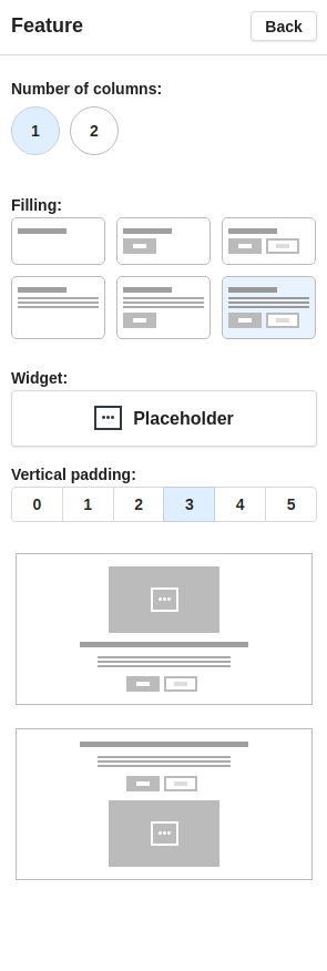
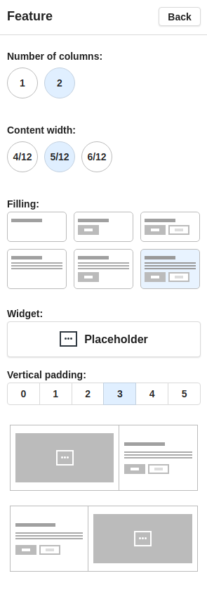
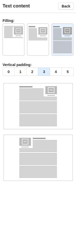
4. Block constructors "Feature horizontal", "Feature vertical", "Text content"
Constructors of simple 1 or 2 column blocks with options to fill them the same way as with the Custom grid constructor. Read more »
In conclusion, users can pick the appropriate block from the gallery "on the fly" or construct it from scratch to build a nice multi-column structure. The content type can be anything from a simple text block to a customized slideshow — there is a number of widgets for that.
Inserted blocks can be freely edited, deleted, you can add new blocks, duplicate existing ones, move them up or down, save as templates and adapt to various viewport sizes. Advanced preview of your Bootstrap breakpoints (target widths for different mobile devices) right in TinyMCE or CKEditor will make you sure the content displays fine for all of your website visitors.
Conclusion
Build your page block by block by choosing them from the gallery or using the block builder feature. Just insert them and then fill them with content. In the following articles of this section we will show how to define and reuse custom blocks, introduce you to Bootstrap Editor editing specifics, and teach you how to create responsive design.